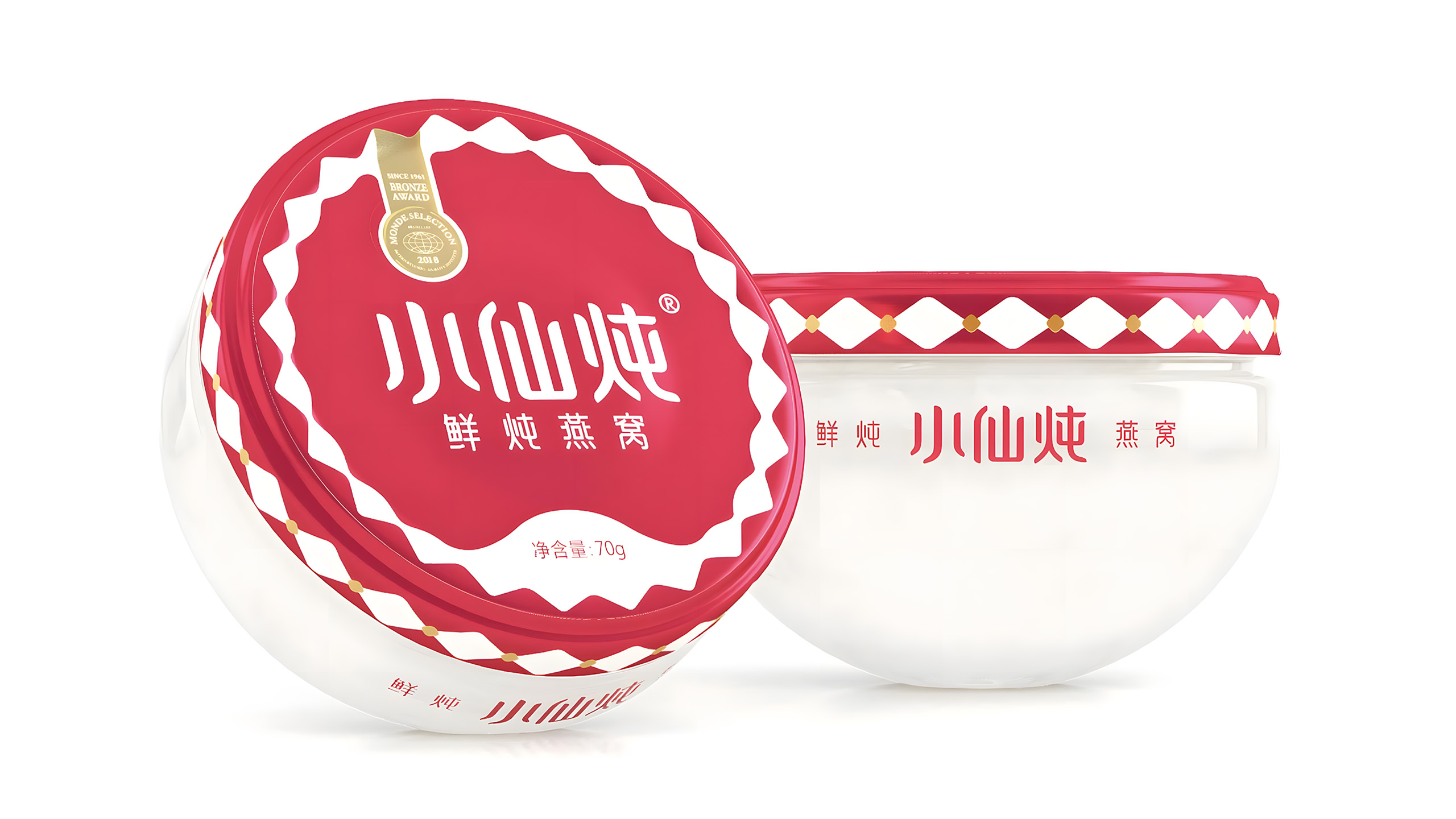
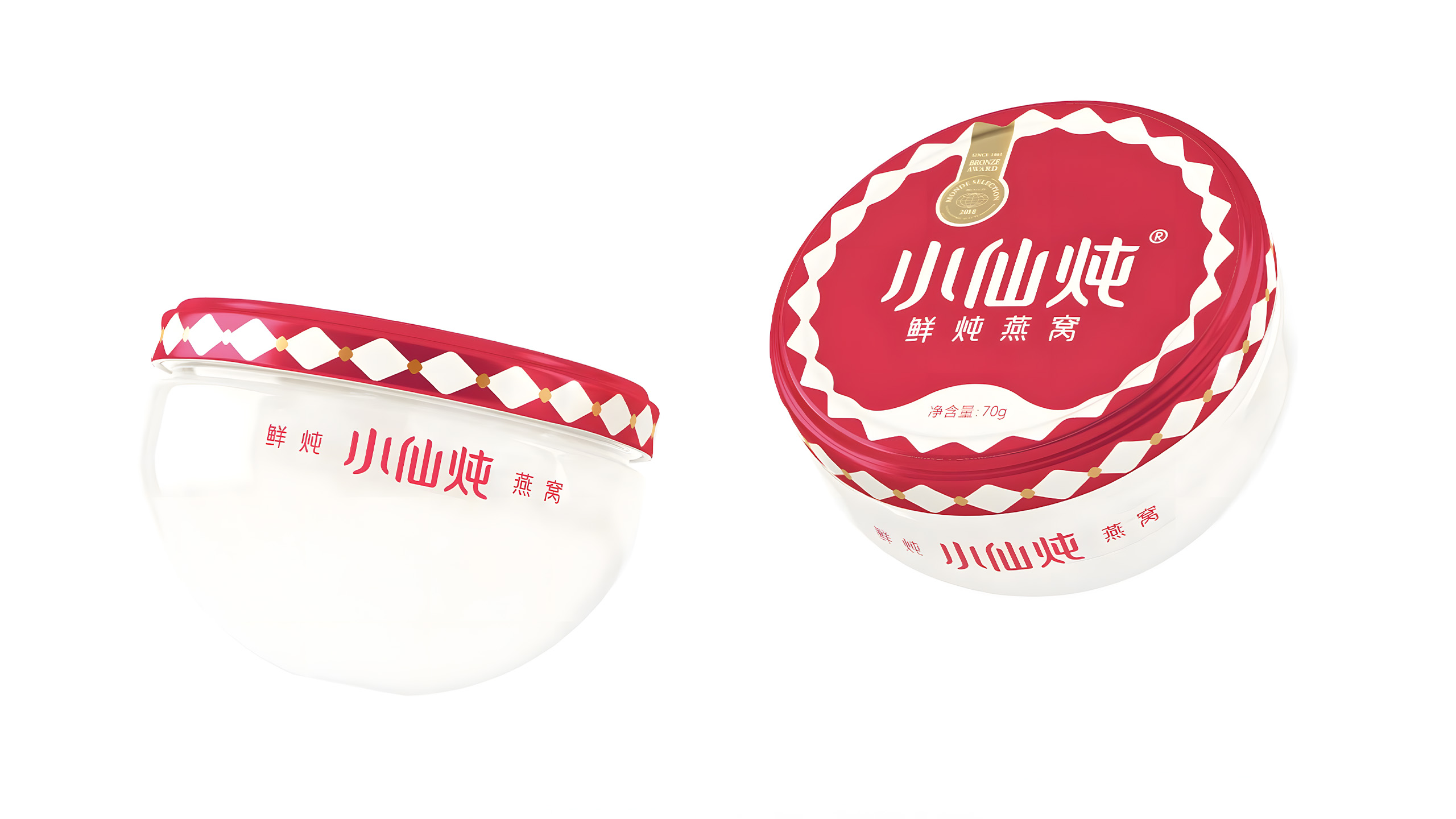
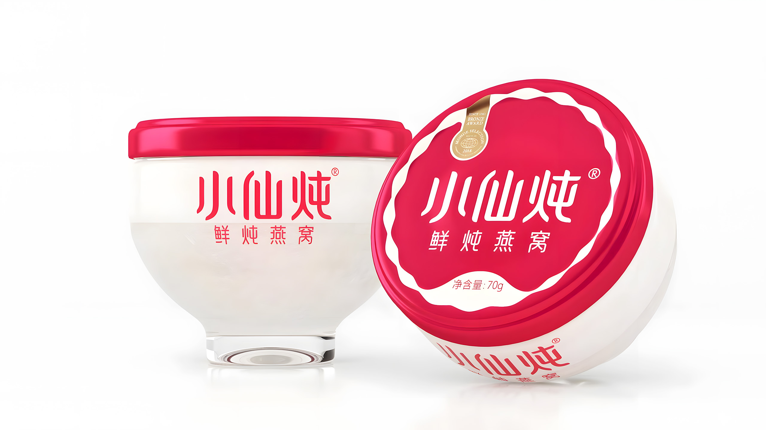
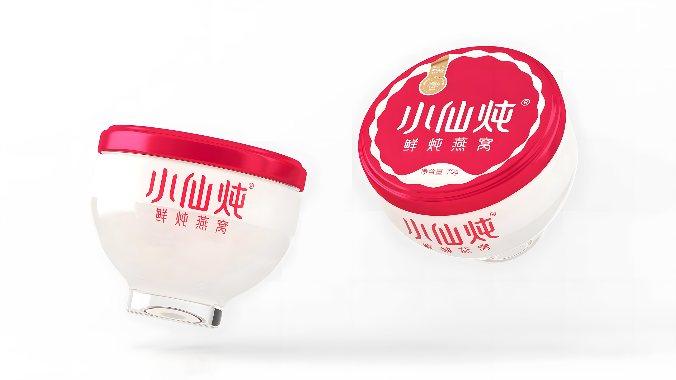
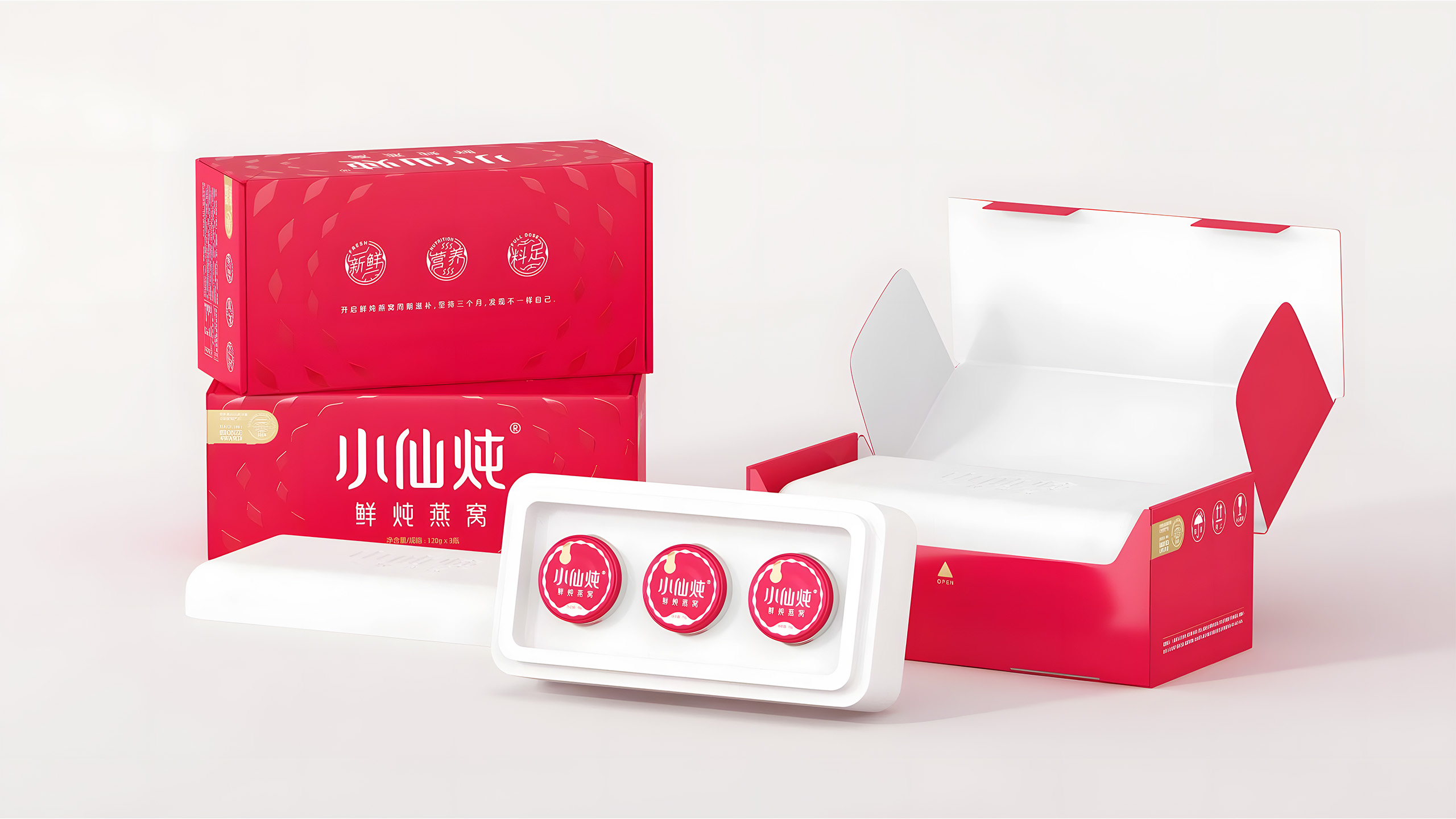
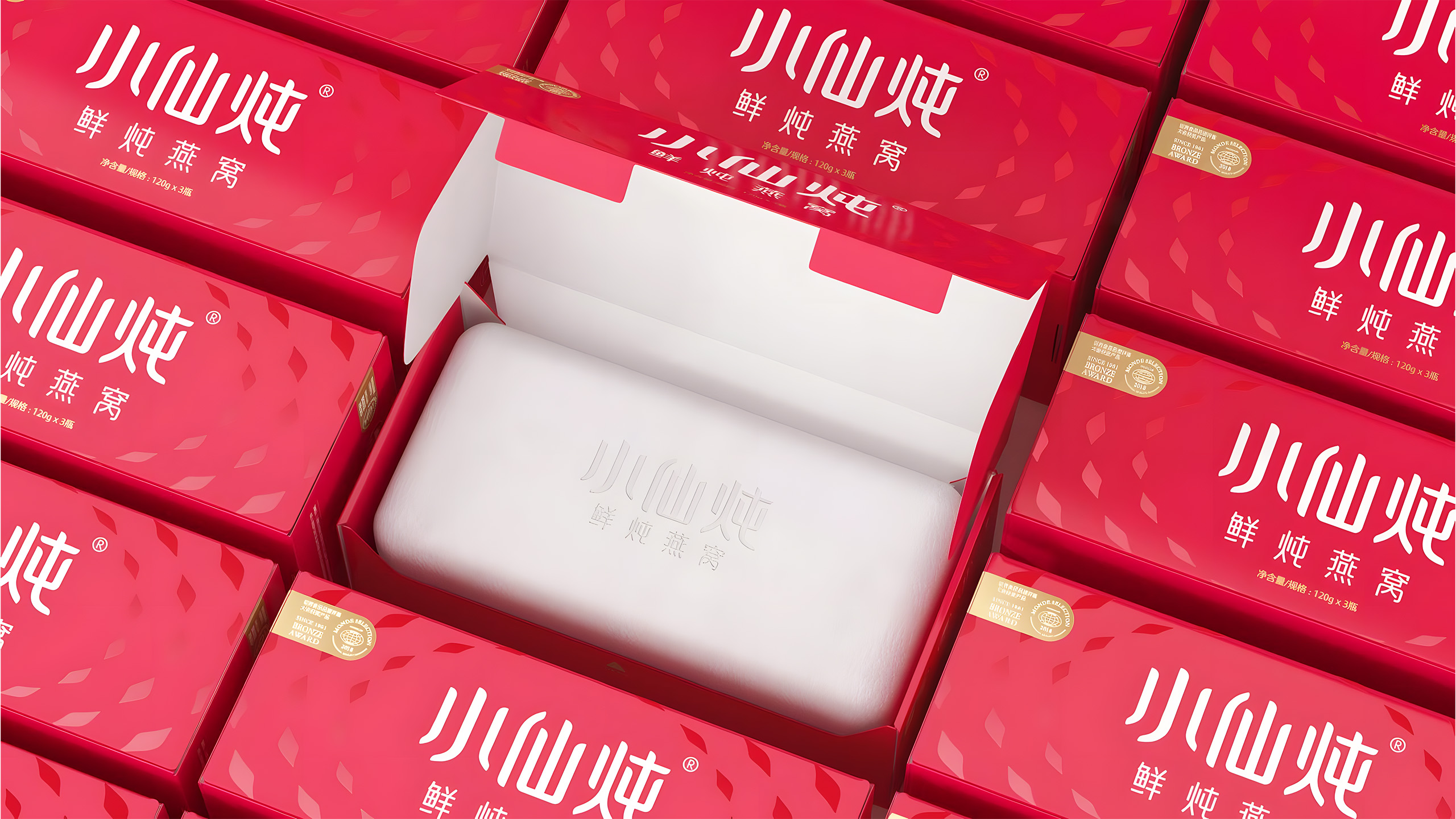
Bird’s nest is a traditional Chinese tonic, and the traditional stewing process is complicated. Before Xiaoxian Dun, the fresh stewed bird’s nest market had long been in a state of “having a product category but no leading brand.” For the bottle design, we drew inspiration from the charm of Song Dynasty official kilns and Jun kilns, blending traditional aesthetics with modern design thinking to strike a precise balance between fashion and tradition, presenting a unique quality that is “traditional but not outdated, fashionable but not vulgar.” The bottle shape also fully considers grip and drinking scenarios, making “ganbei” (cheers) a new way to enjoy bird’s nest.
For the brand logo, we preserved the artistic spirit of Chinese calligraphy, highly abstracting the strokes—dots, sweeping strokes, and turns—and incorporating rounded corners inspired by the strands of bird’s nest to achieve overall visual harmony. As a traditional tonic, bird’s nest previously attracted little attention from younger generations. We focused on consumer pain points and reshaped bird’s nest into a fresh, nutritious tonic that is convenient, fashionable, and ready to enjoy anytime, bringing new vitality to traditional wellness. Today, Xiaoxian Dun has become a leading brand in this category.