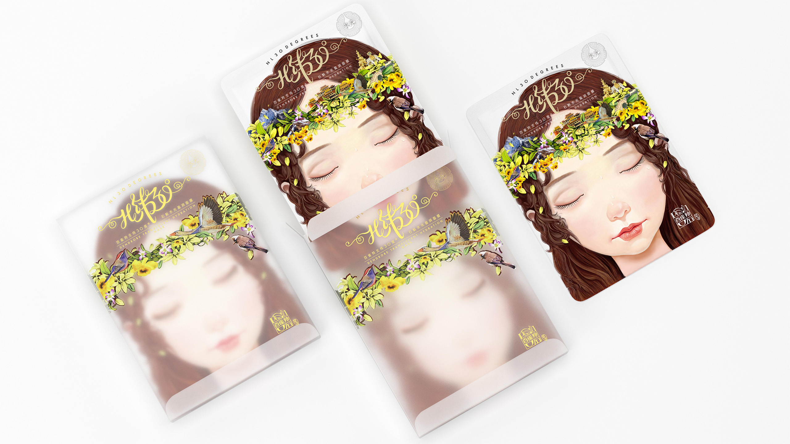
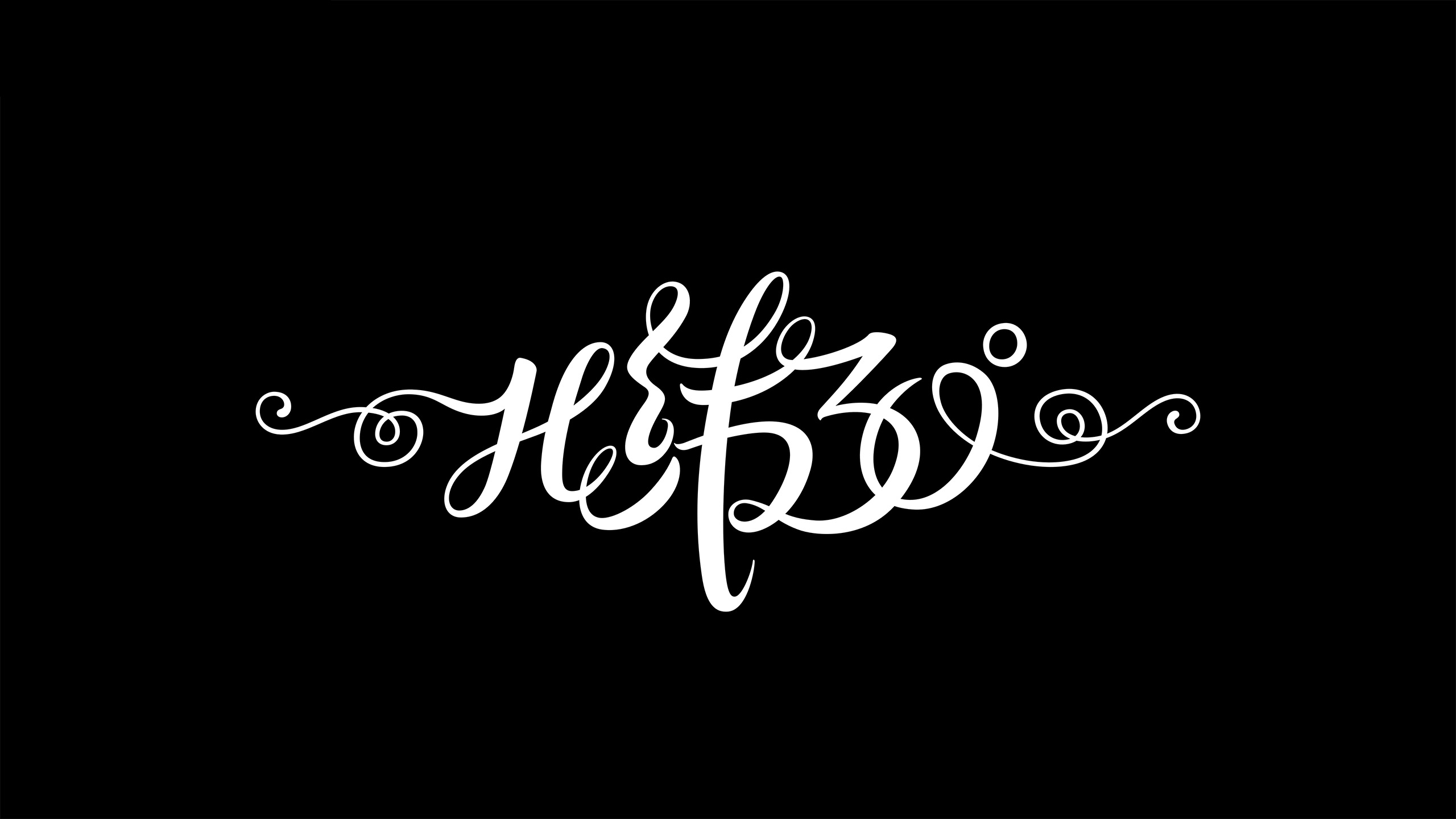
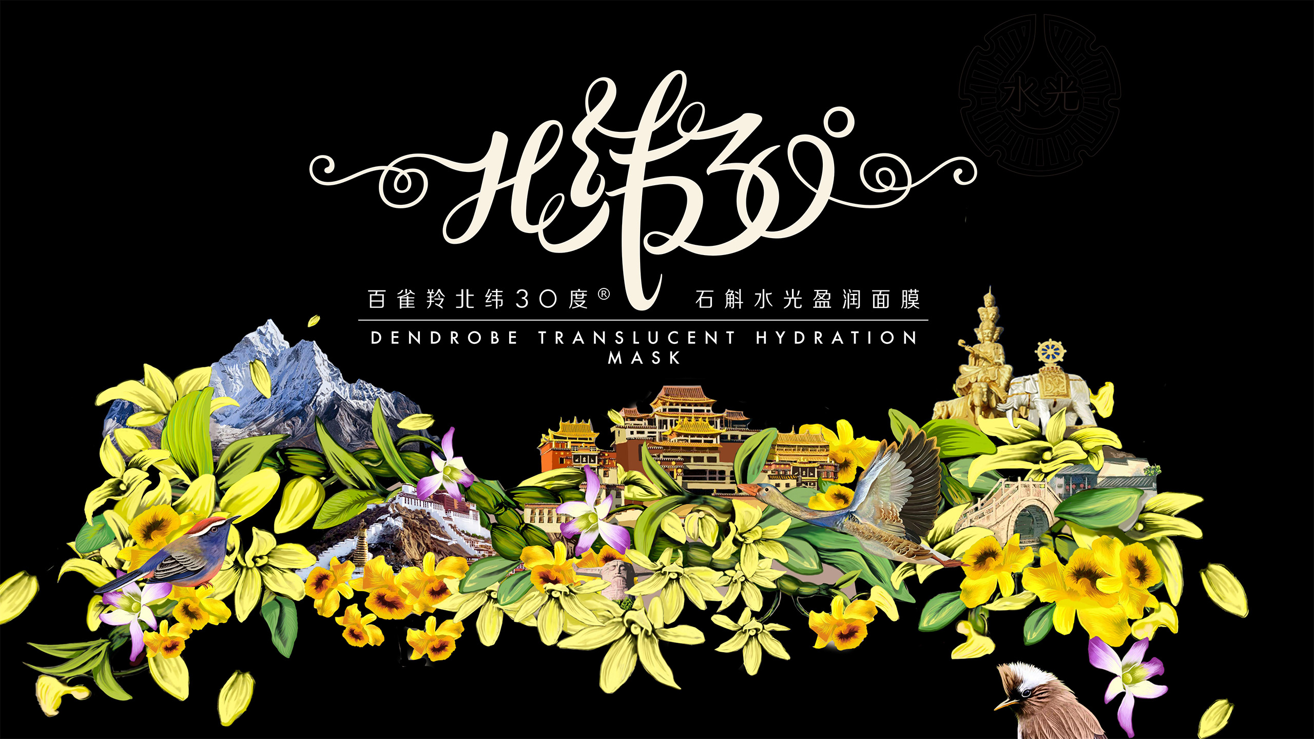
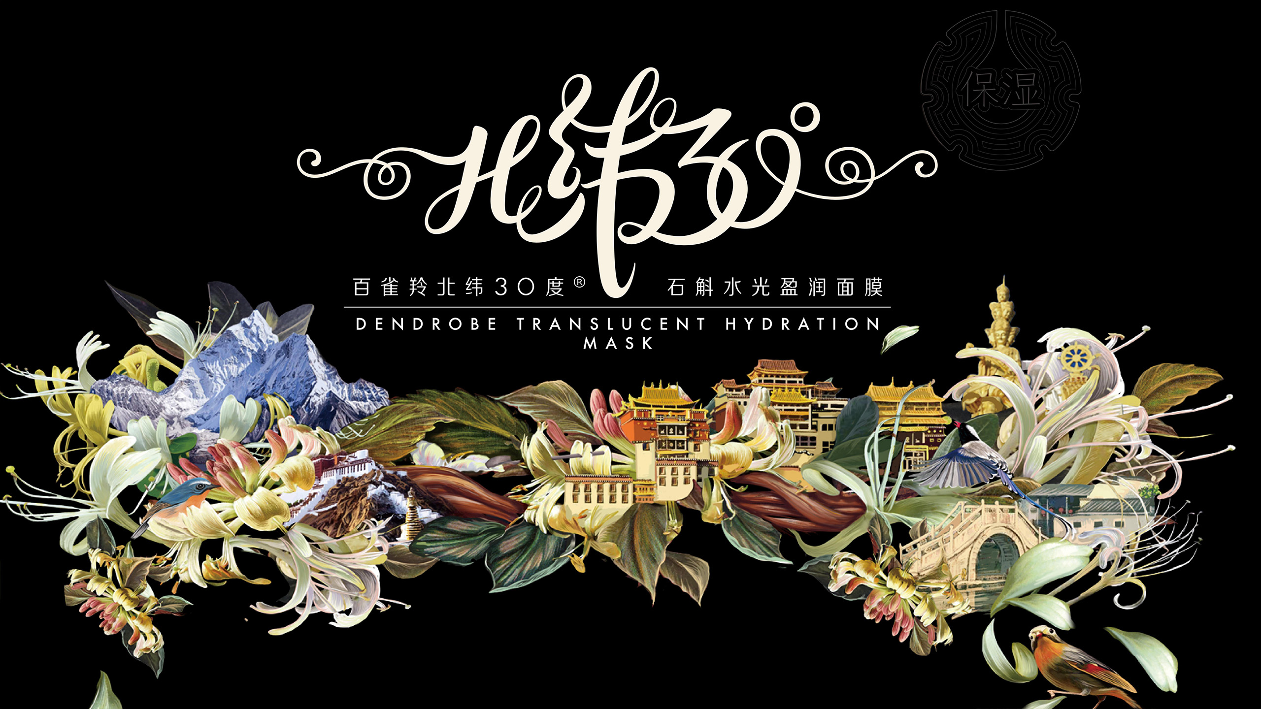
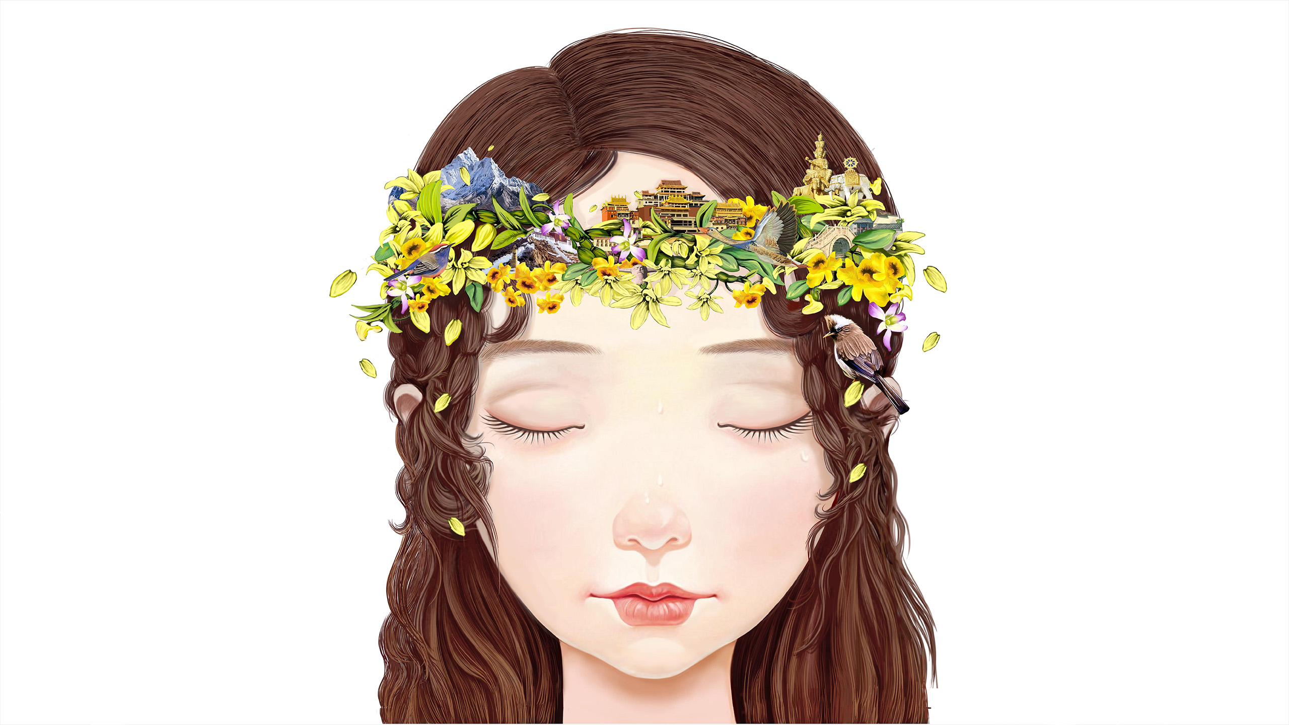
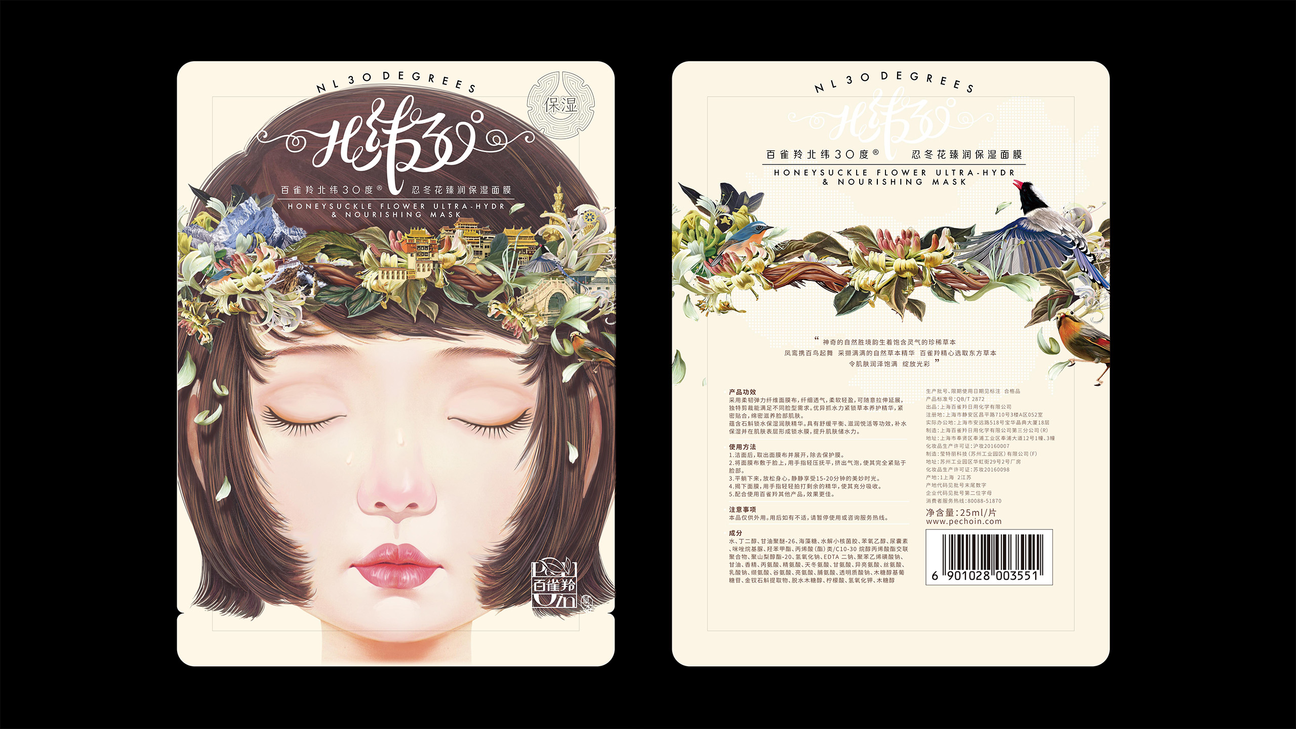
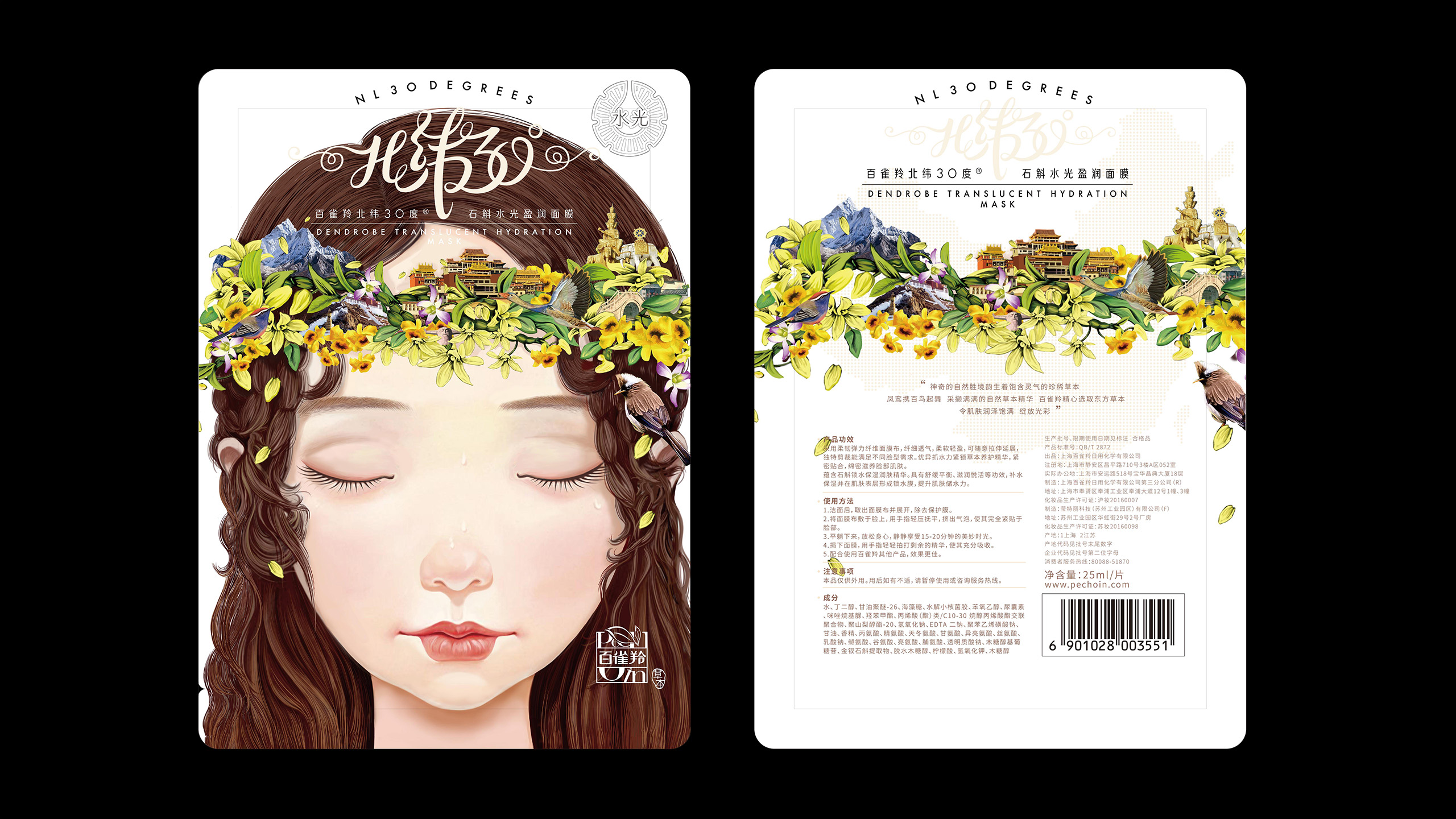
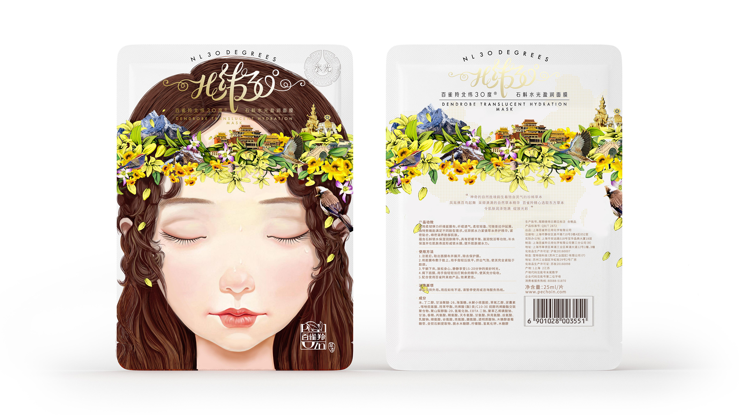
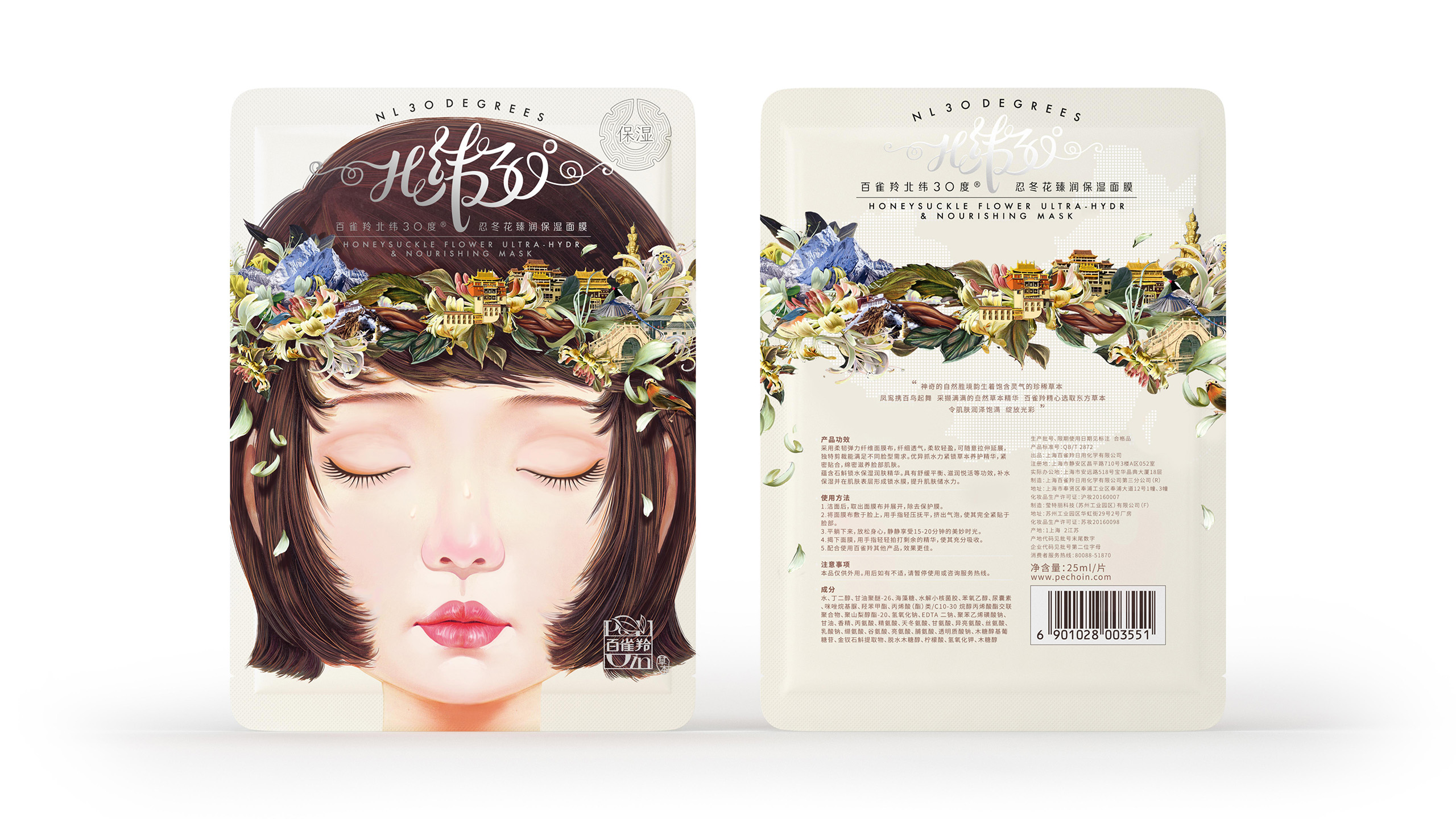
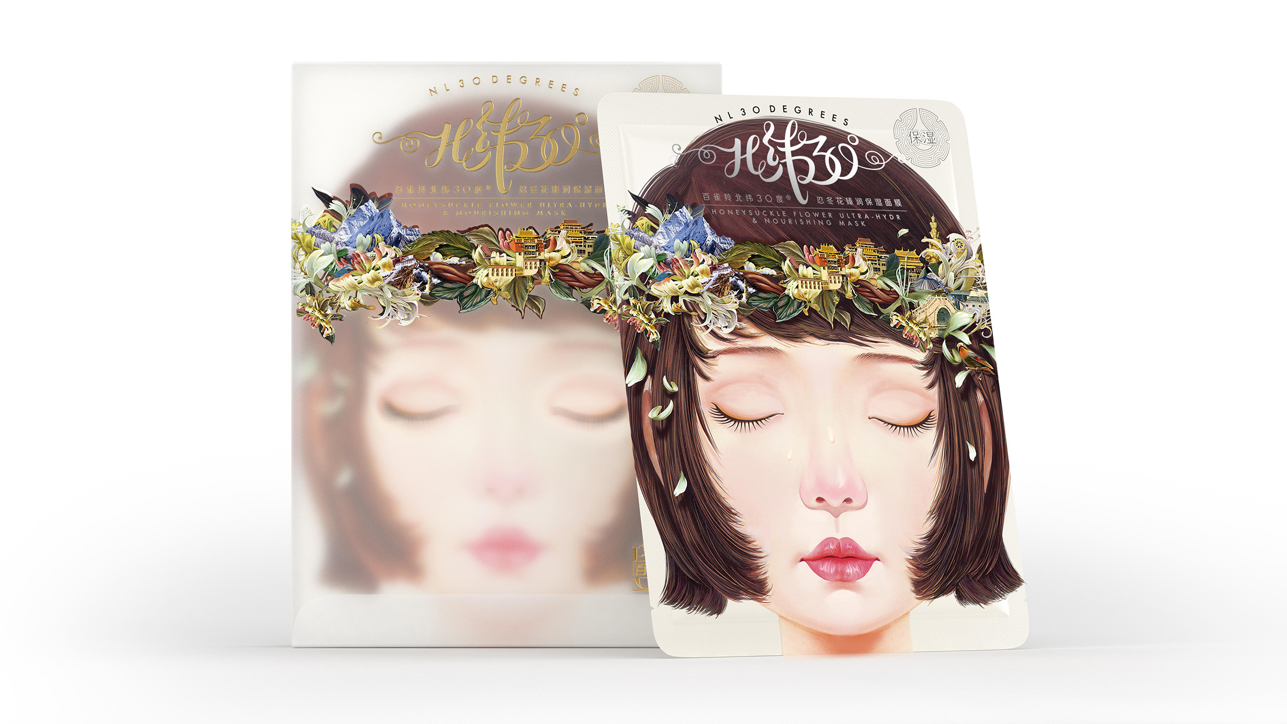
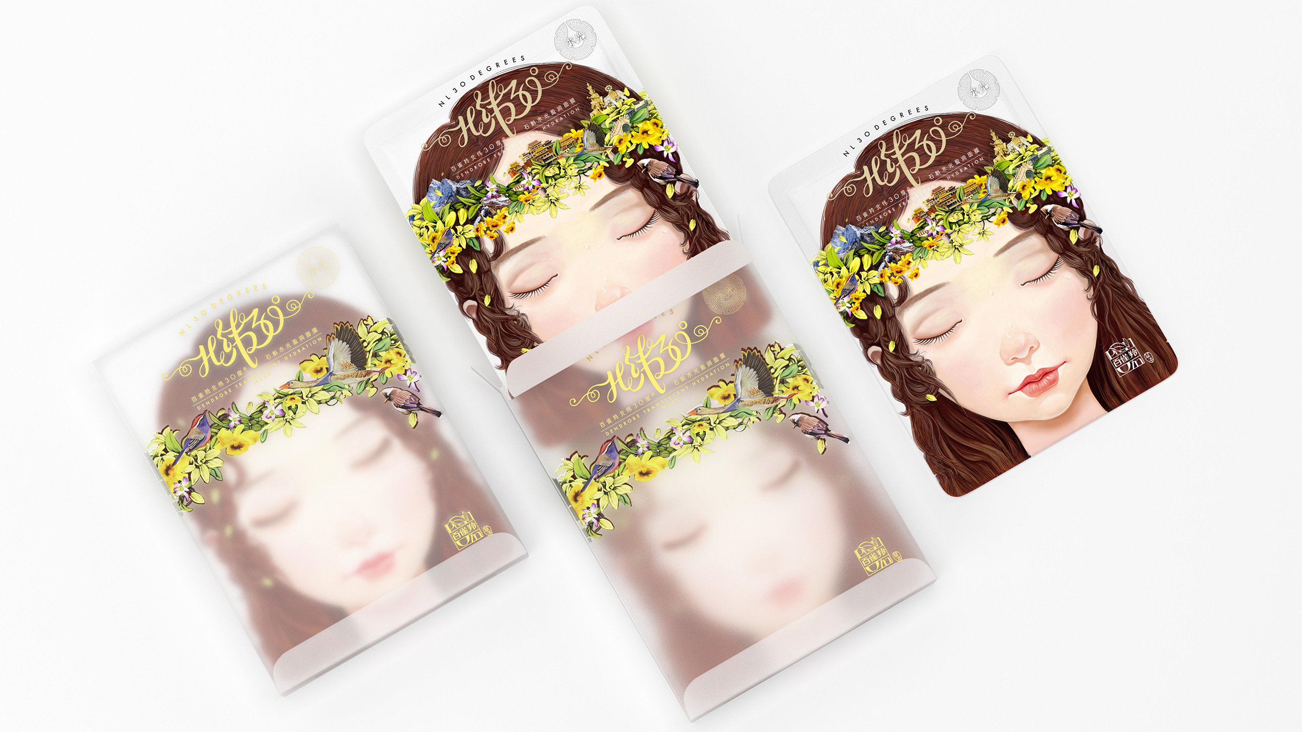
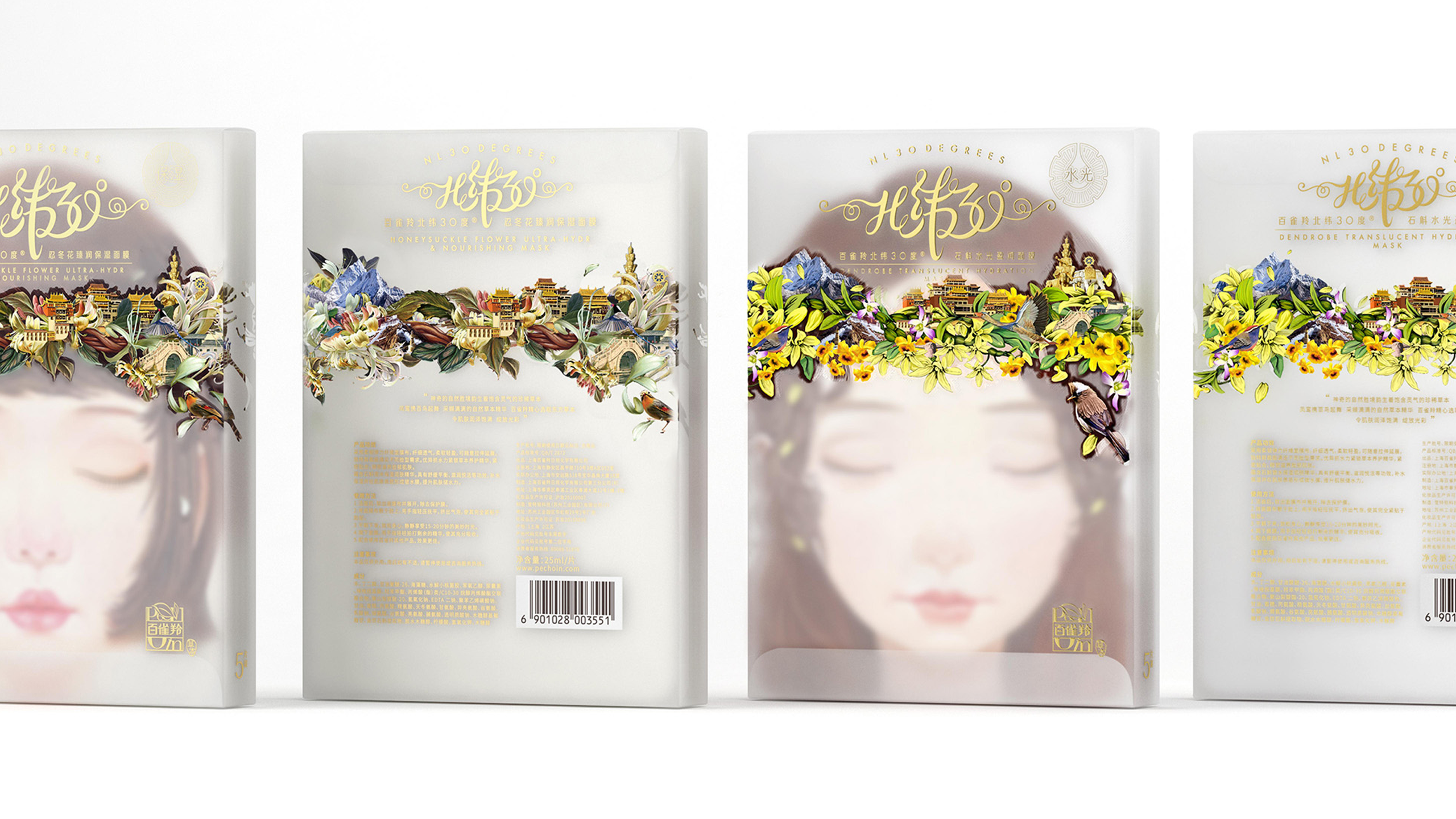
The packaging key visual is inspired by famous scenic spots along the 30°N latitude, transforming the poetry and mystery of natural landscapes into a lively fairy figure wearing a floral wreath. The wreath incorporates plant elements unique to the 30°N latitude, symbolizing natural extraction and hydrating energy. The fairy’s light posture and gentle expression convey the hydrating, soothing, and pleasurable sensation brought by the mask. Paired with a dynamic, lightweight custom typeface design, the overall visual is fresh and elegant, vividly presenting the core concept of “hydrating beauty” of the 30°N Latitude Facial Mask, giving the packaging both artistic appeal and strong brand recognition.