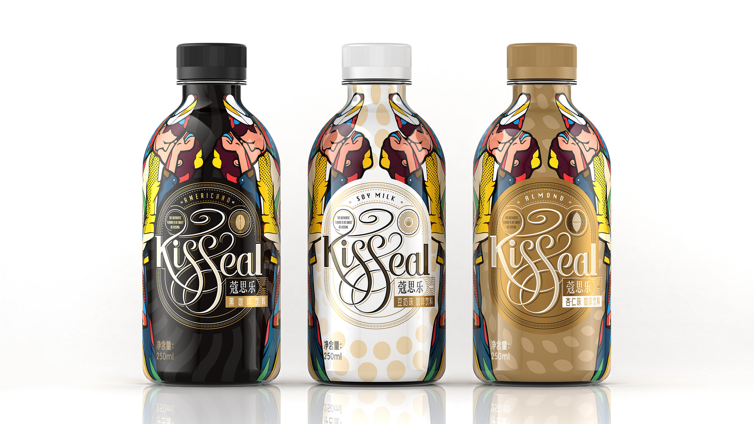
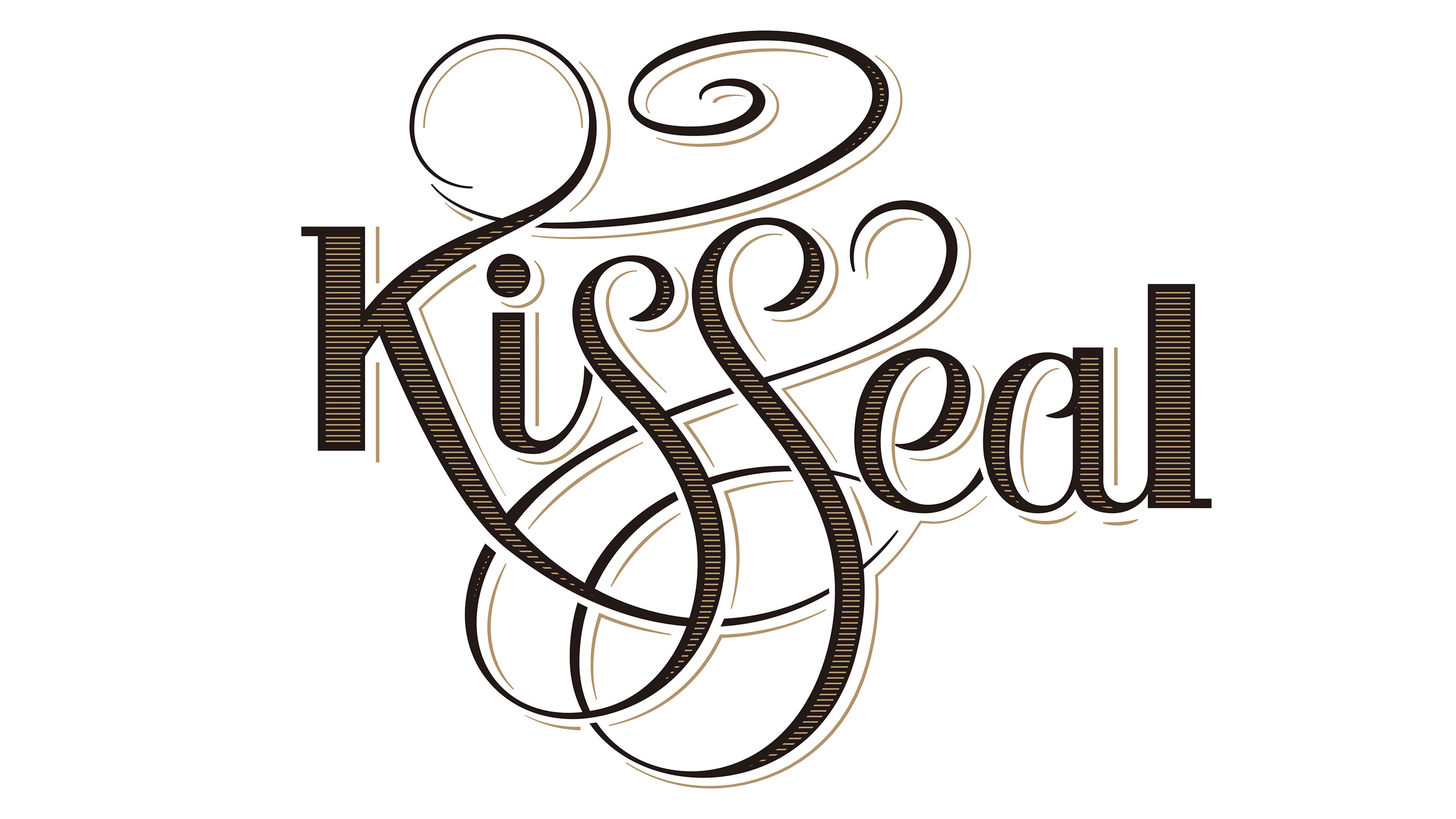
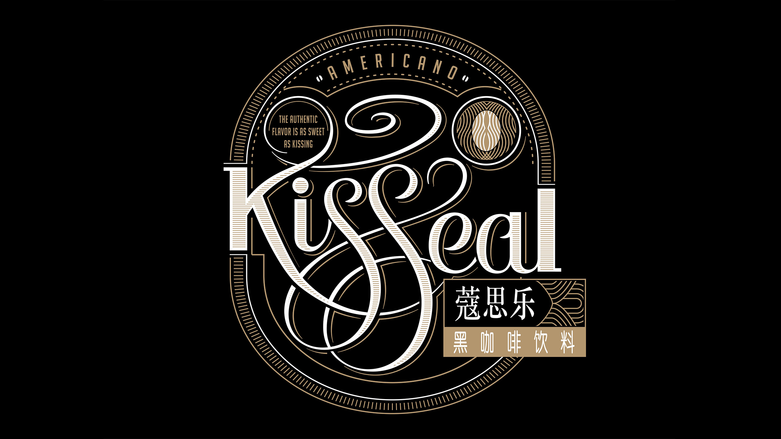
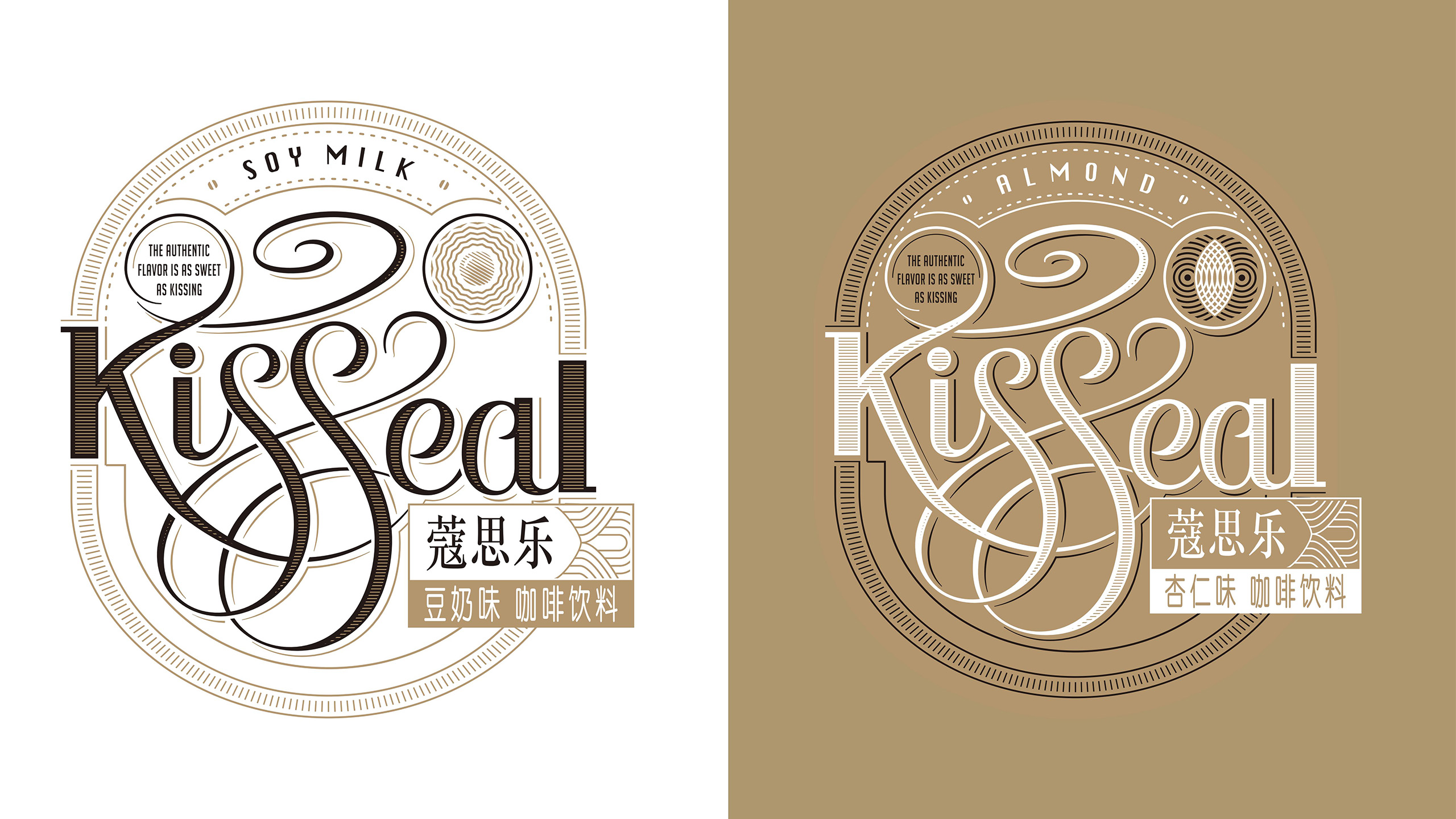
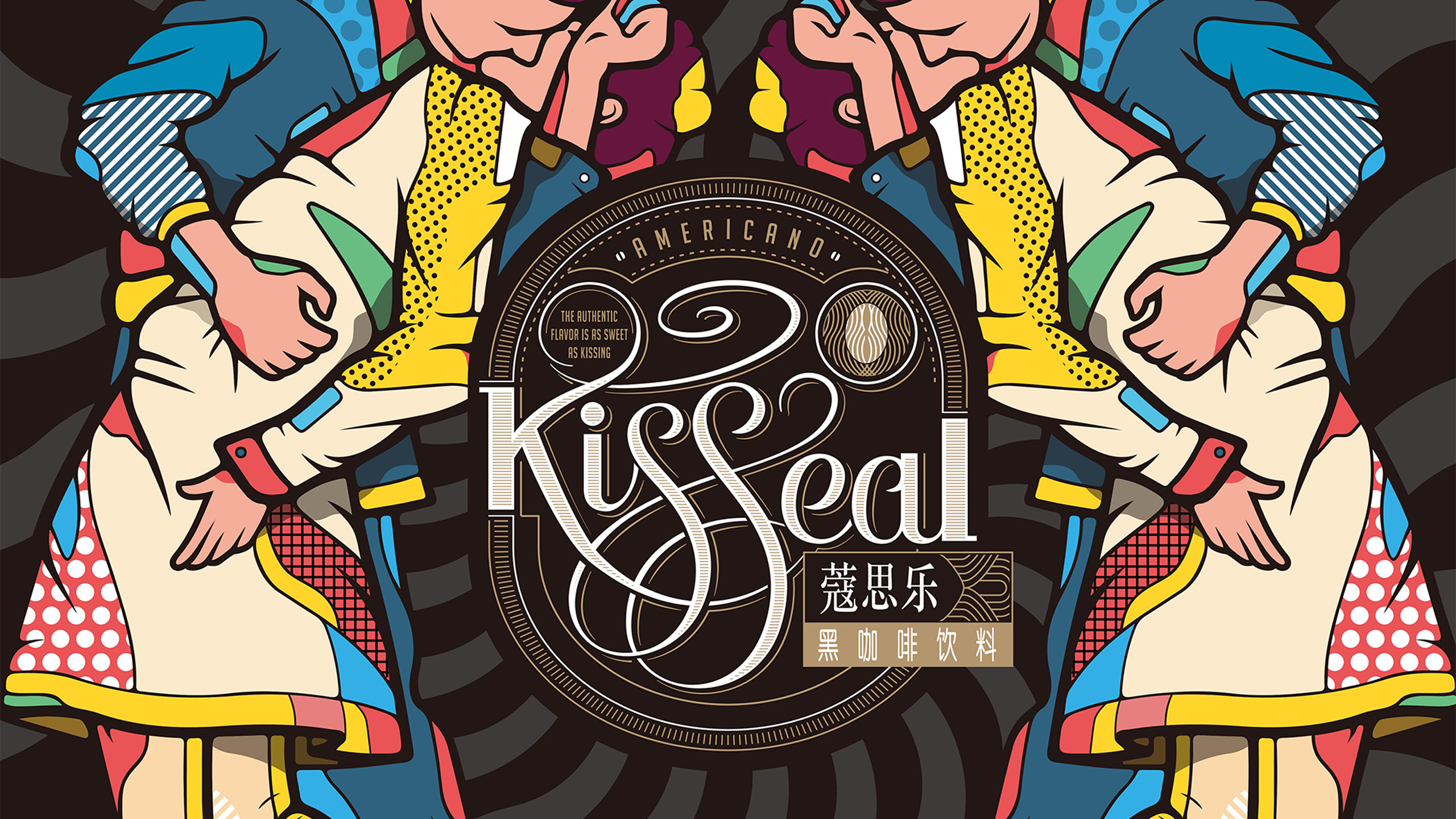
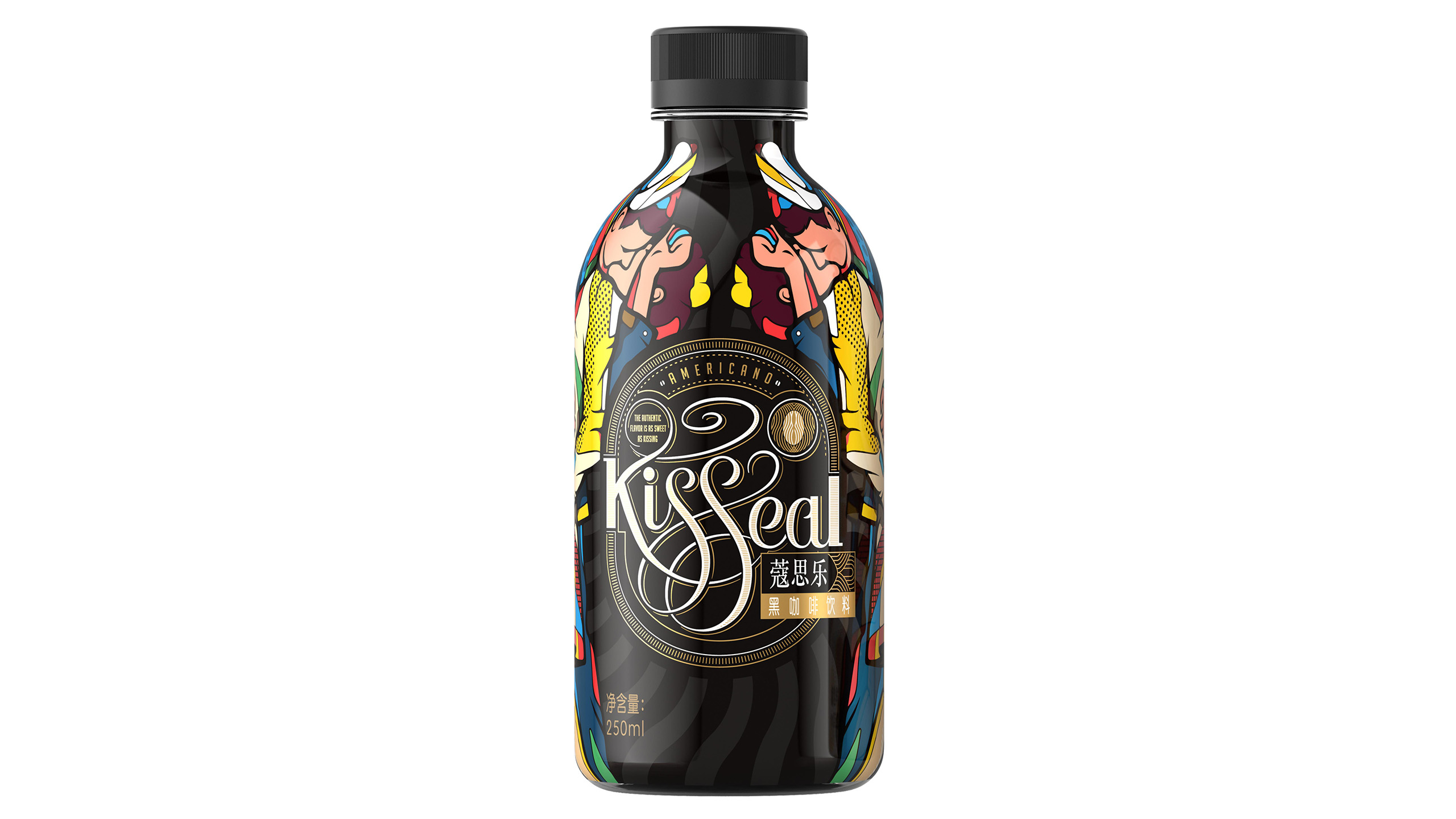
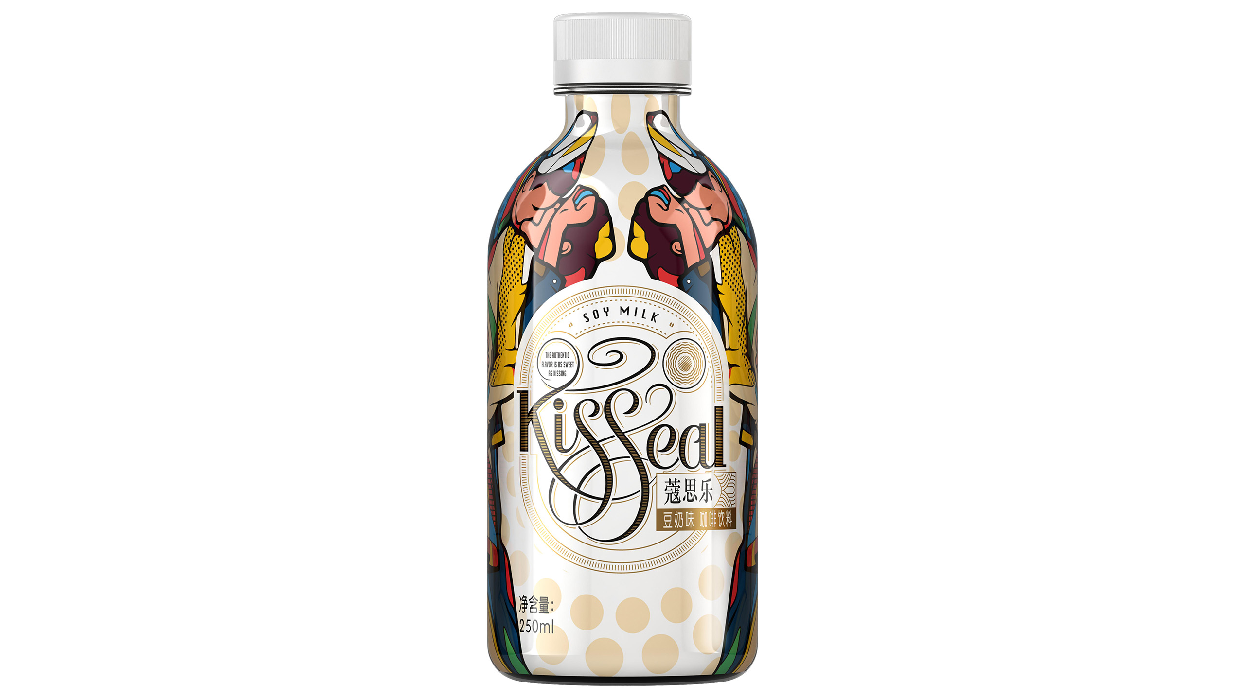
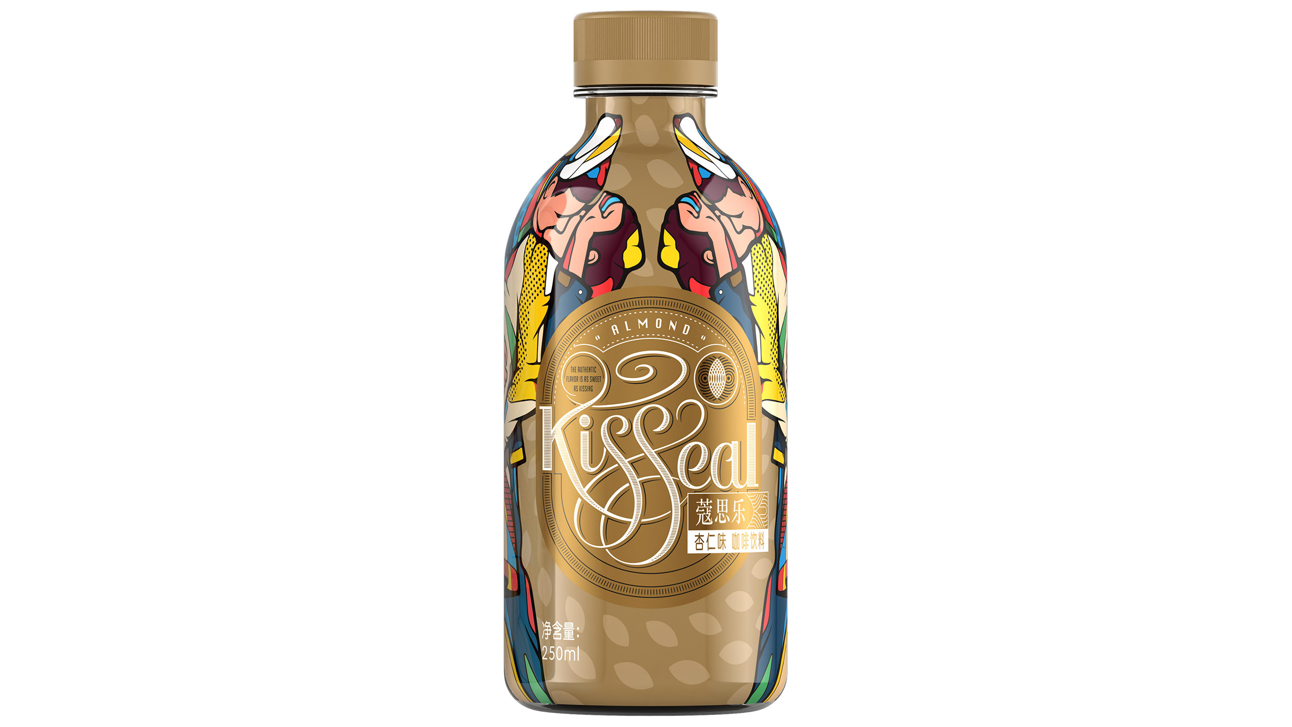
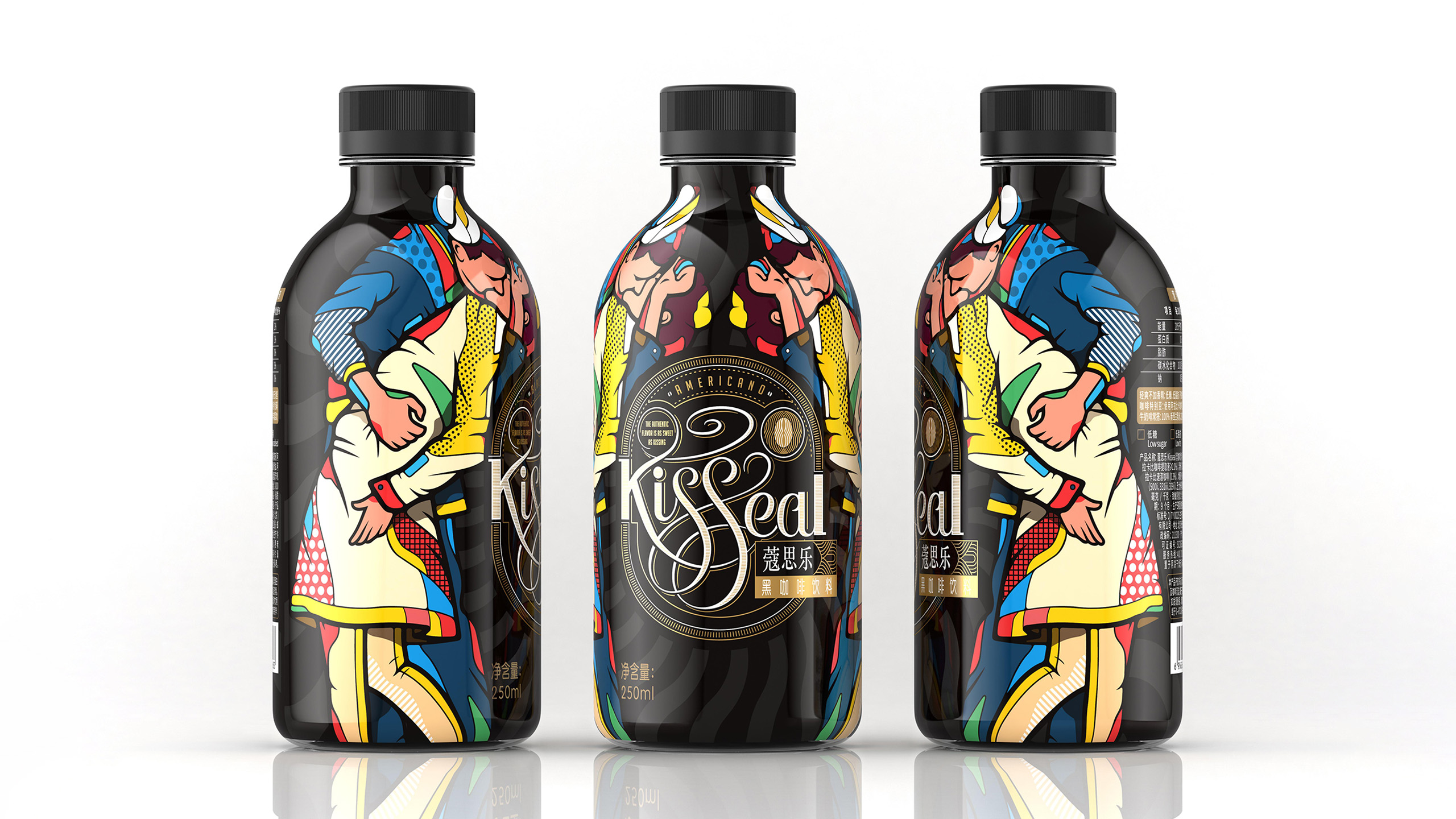
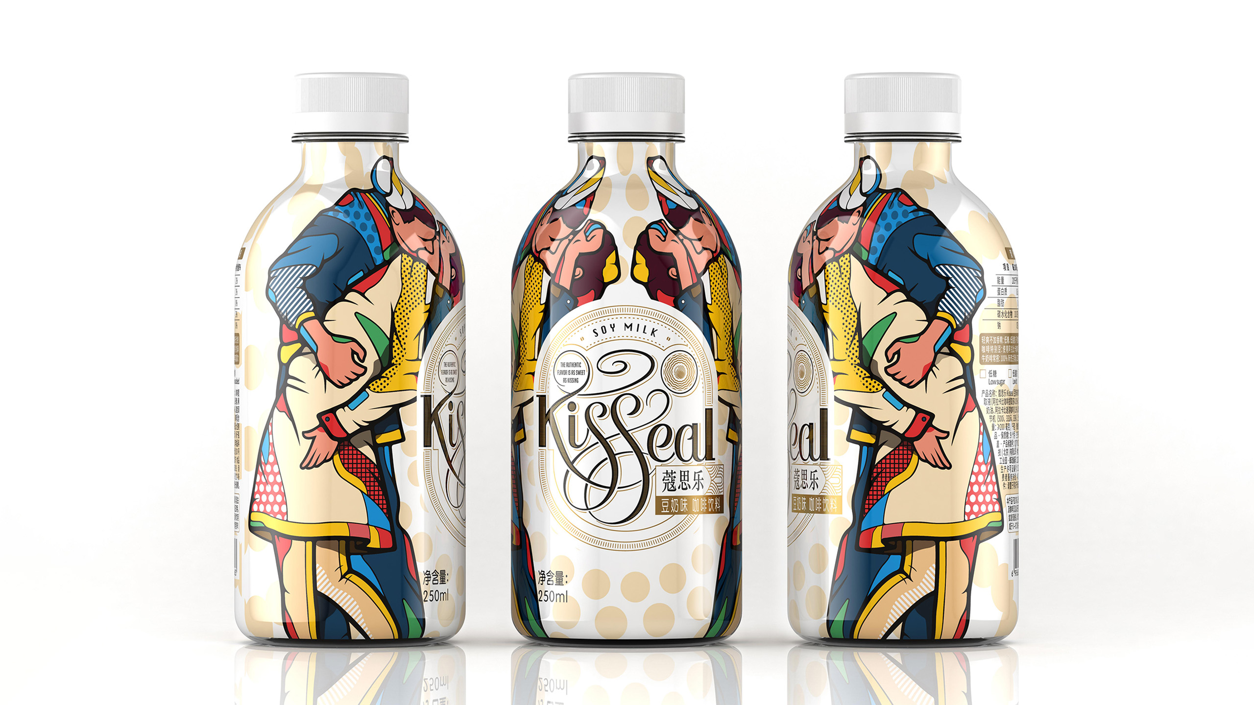
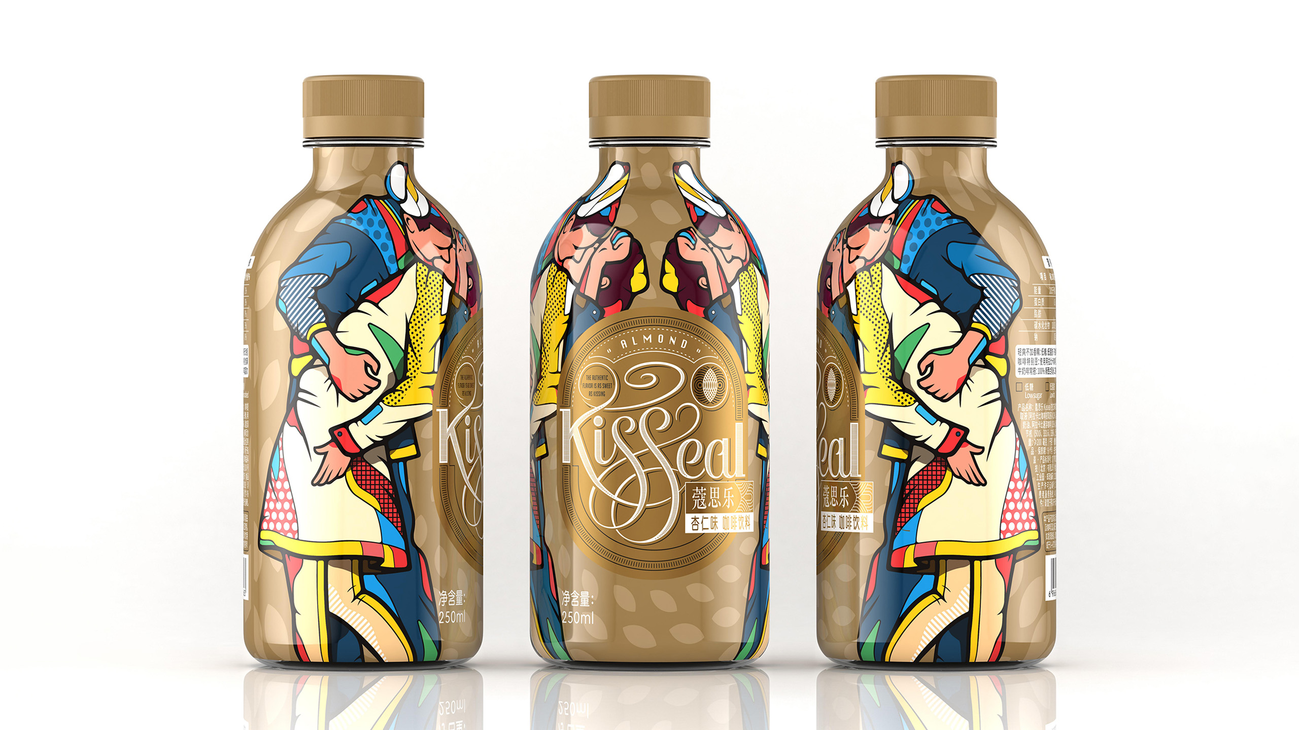
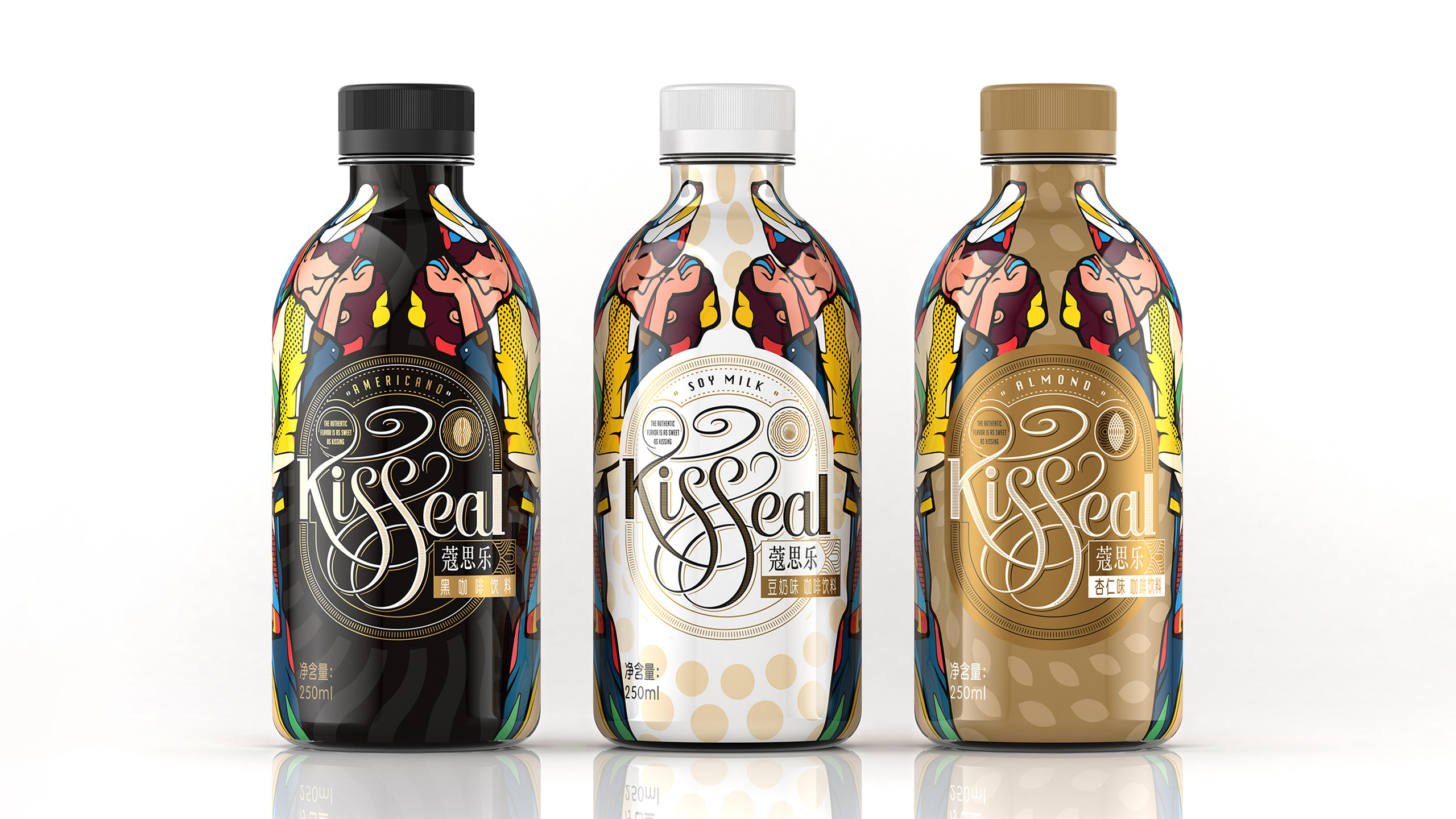
The brand name Kisseal is formed by combining “Kiss” and “Seal,” meaning “one kiss seals it all”—the kiss represents love and intimacy, while the seal symbolizes a promise of quality and the preservation of flavor. The brand visual identity is built around this core idea: the logo is rendered with a woodcut print texture, giving the brand a handcrafted, classic feel and a tangible warmth. The letterforms are intertwined and flowing, moving like the aroma of coffee, conveying a romantic and vibrant brand character. At the same time, pop-art-inspired kissing illustrations reinforce brand recognition through a bold, modern visual language, while geometric background patterns create order and rhythm, keeping the overall visual clear and distinctive within its artistic expression. These elements work together to shape a coffee brand image that combines vintage texture, modern vitality, and emotional tension.